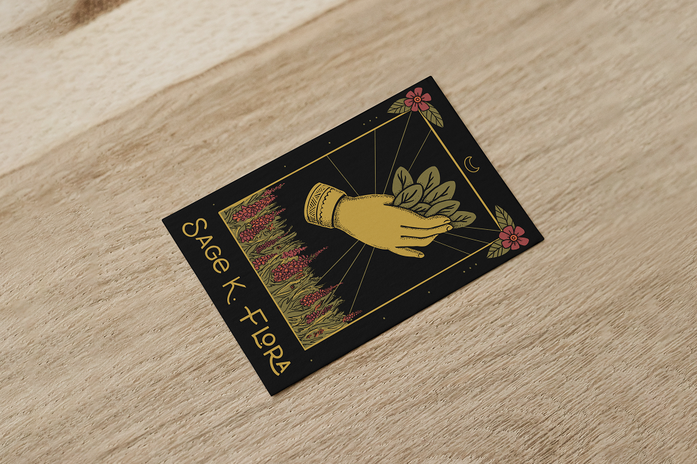
Sage K. Flora hired me to help her establish a brand identity for her florist business, and more specifically, a business card. She came with an established color palette, and inspiration from traditional American tattoos and modern tarot decks. A witchy designer’s dream! Sage is an Oakland-based wedding, event, and editorial floral designer.
For the logo, Sage knew she wanted a stylized hand. I came up with various hands, and ultimately we picked one holding a bundle of sage leaves with a patterned cuff. I added stippling to the illustration to imitate traditional tattoo shading.
cards and other graphics
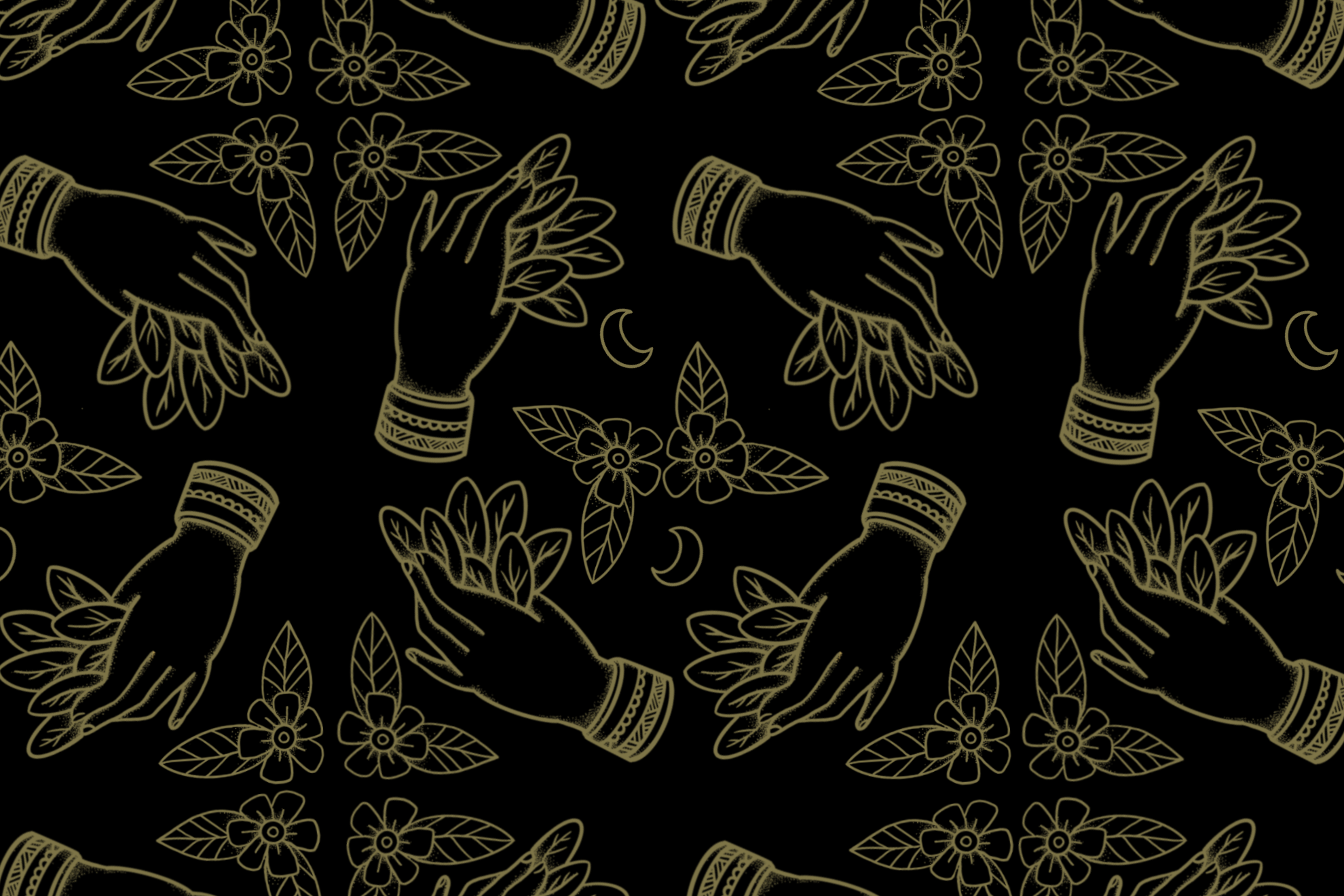
Sage requested a tarot card reimagined as a business card, so I placed the logo centrally in a landscape of foxgloves and a tattoo-referencing frame. We went with a typeface that felt both modern and witchy, feminine and powerful. After the business card was done, I kept having fun and made a playing card back, banner, and pattern.


